import matplotlib.pyplot as plt11-Matplotlib
Notebook
Link to the Google Colaboratory notebook: 11-Matplotlib
Matplotlib is a low level graph plotting library in python that serves as a visualization utility.
Installation
If you have Python and PIP already installed on a system, then installation of Matplotlib is very easy.
pip install matplotlib
Notebook
If you’re using a notebook, the installation process is a little different: you need to add a ! before the pip:
!pip install matplotlibMost of the Matplotlib utilities lies under the pyplot submodule, and are usually imported under the plt alias:
An example is a the plot of a line in a diagram from position (0,0) to position (6,77):
import matplotlib.pyplot as plt
import numpy as np

xpoints = np.array([0, 6])
ypoints = np.array([0, 250])

plt.plot(xpoints, ypoints)
plt.show()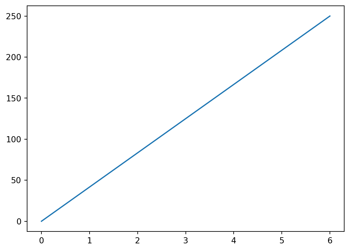
Plotting
The plot() function is used to draw points (markers) in a diagram.
By default, the plot() function draws a line from point to point.
The function takes parameters for specifying points in the diagram.
Parameter 1 is an array containing the points on the x-axis.
Parameter 2 is an array containing the points on the y-axis.
If we need to plot a line from (1, 3) to (8, 10), we have to pass two arrays [1, 8] and [3, 10] to the plot function.
import matplotlib.pyplot as plt
import numpy as np

xpoints = np.array([1, 8])
ypoints = np.array([3, 10])

plt.plot(xpoints, ypoints)
plt.show()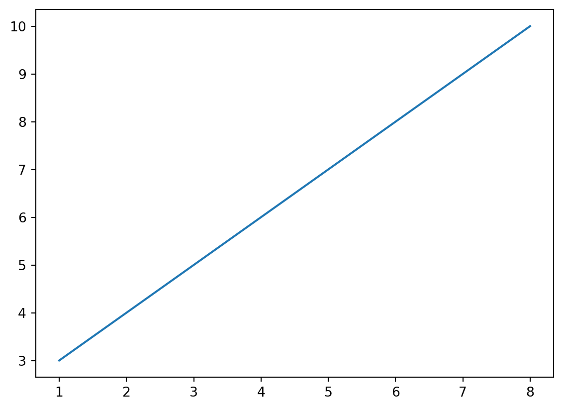
To plot only the markers, you can use shortcut string notation parameter ‘o’, which means ‘rings’.
plt.plot(xpoints, ypoints, 'o')
plt.show()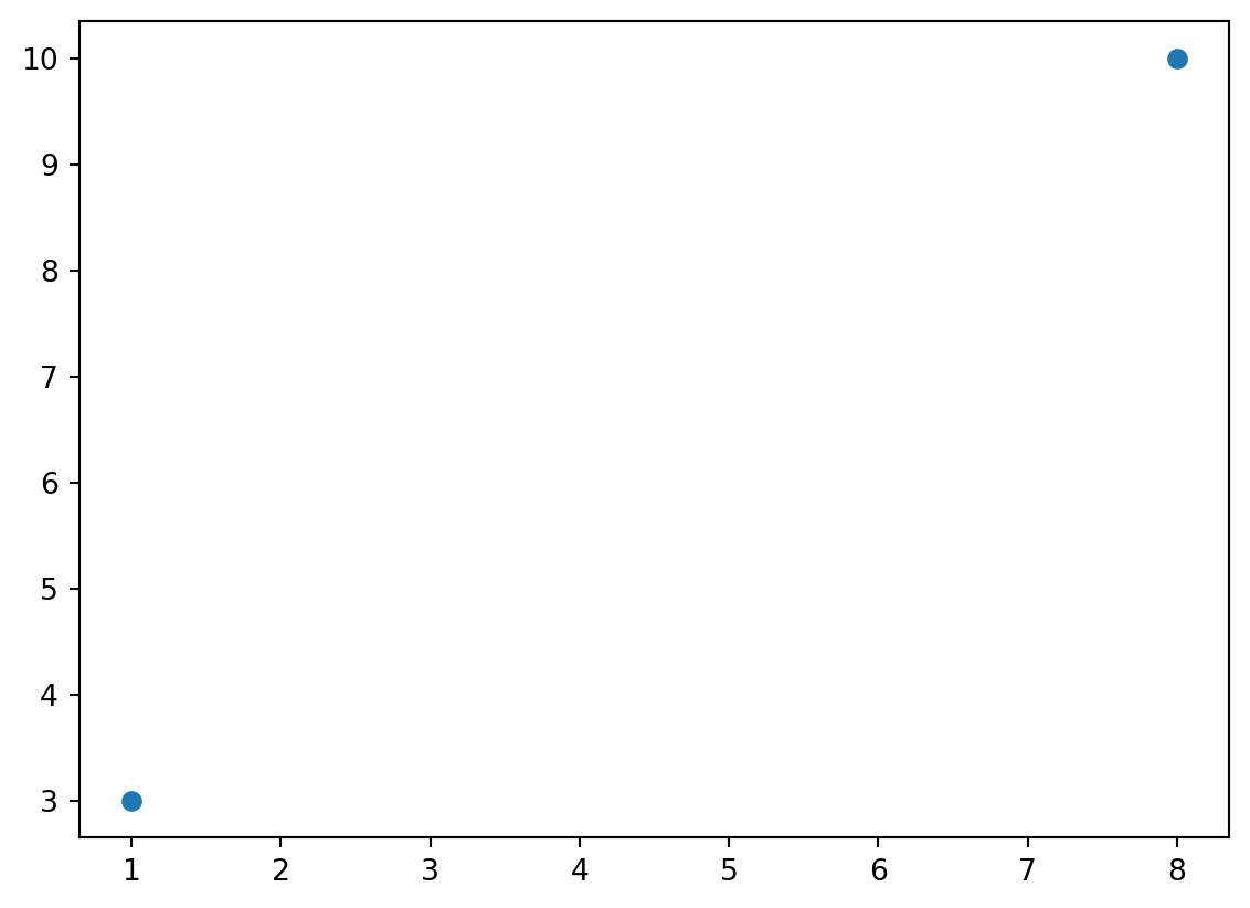
Example
Draw a line in a diagram from position (1, 3) to (2, 8) then to (6, 1) and finally to position (8, 10):
import matplotlib.pyplot as plt
import numpy as np

xpoints = np.array([1, 2, 6, 8])
ypoints = np.array([3, 8, 1, 10])

plt.plot(xpoints, ypoints)
plt.show()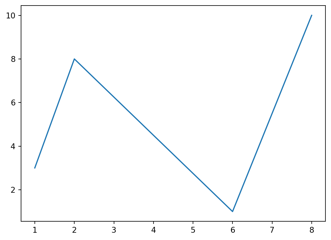
You can use the keyword argument linestyle, or shorter ls, to change the style of the plotted line:
import matplotlib.pyplot as plt
import numpy as np

ypoints = np.array([3, 8, 1, 10])

plt.plot(ypoints, linestyle = 'dotted')
plt.show()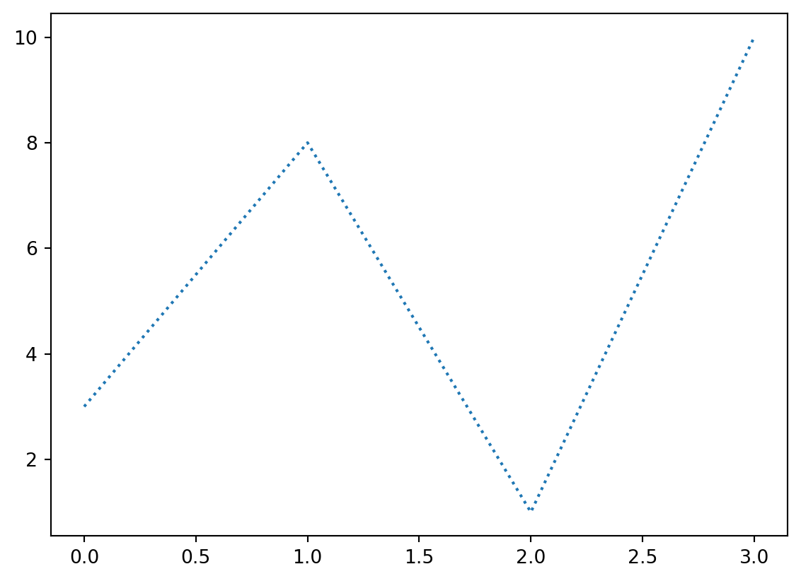
Labels
With Pyplot, you can use the xlabel() and ylabel() functions to set a label for the x- and y-axis.
import numpy as np
import matplotlib.pyplot as plt

x = np.array([80, 85, 90, 95, 100, 105, 110, 115, 120, 125])
y = np.array([240, 250, 260, 270, 280, 290, 300, 310, 320, 330])

plt.plot(x, y)

plt.xlabel("Average Pulse")
plt.ylabel("Calorie Burnage")

plt.show()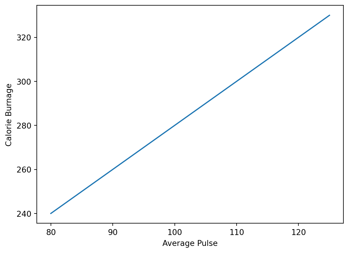
Title
You can use the title() function to set a title for the plot.
import numpy as np
import matplotlib.pyplot as plt

x = np.array([80, 85, 90, 95, 100, 105, 110, 115, 120, 125])
y = np.array([240, 250, 260, 270, 280, 290, 300, 310, 320, 330])

plt.plot(x, y)

plt.xlabel("Average Pulse")
plt.ylabel("Calorie Burnage")
plt.title("Some random variables")

plt.show()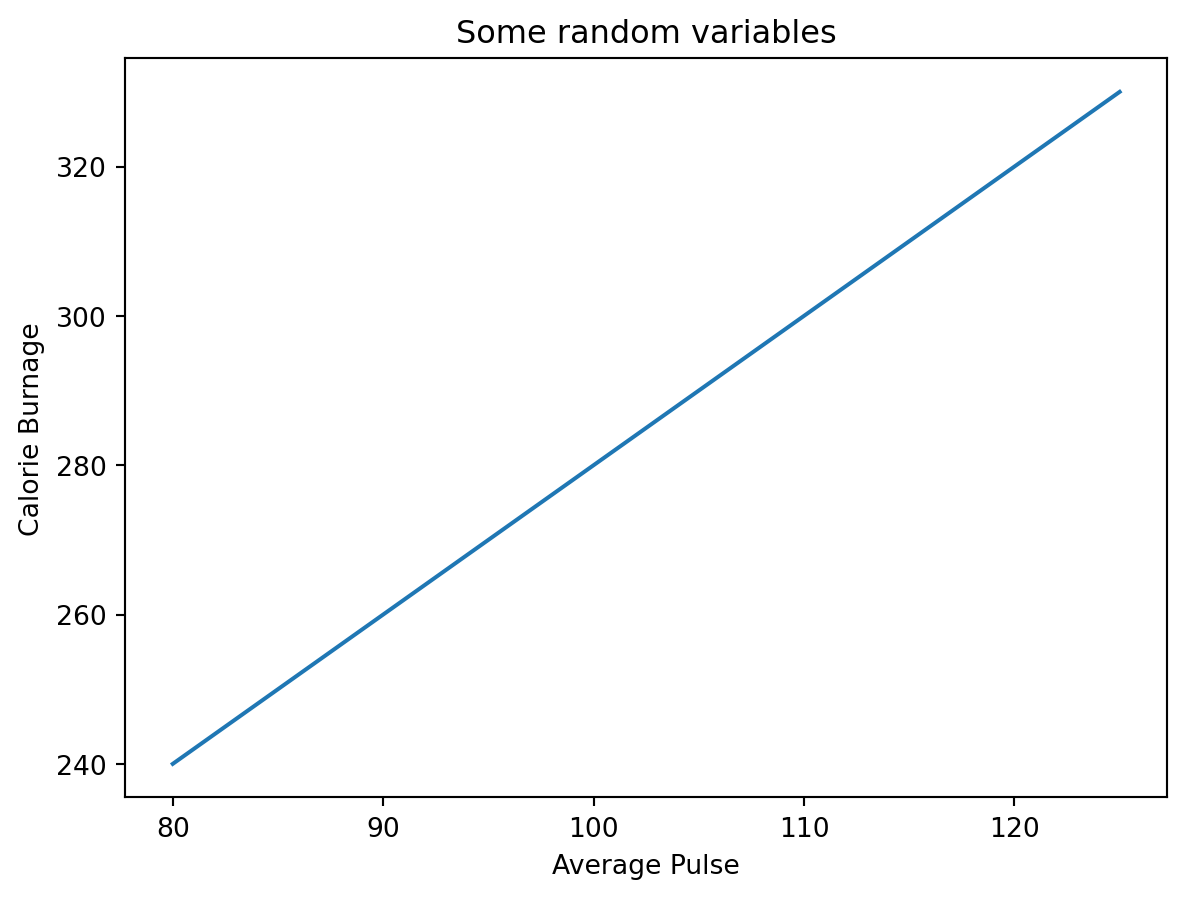
Subplots
With the subplot() function you can draw multiple plots in one figure:
import matplotlib.pyplot as plt
import numpy as np

#plot 1:
x = np.array([0, 1, 2, 3])
y = np.array([3, 8, 1, 10])

plt.subplot(1, 2, 1)
plt.plot(x,y)

#plot 2:
x = np.array([0, 1, 2, 3])
y = np.array([10, 20, 30, 40])

plt.subplot(1, 2, 2)
plt.plot(x,y)

plt.show()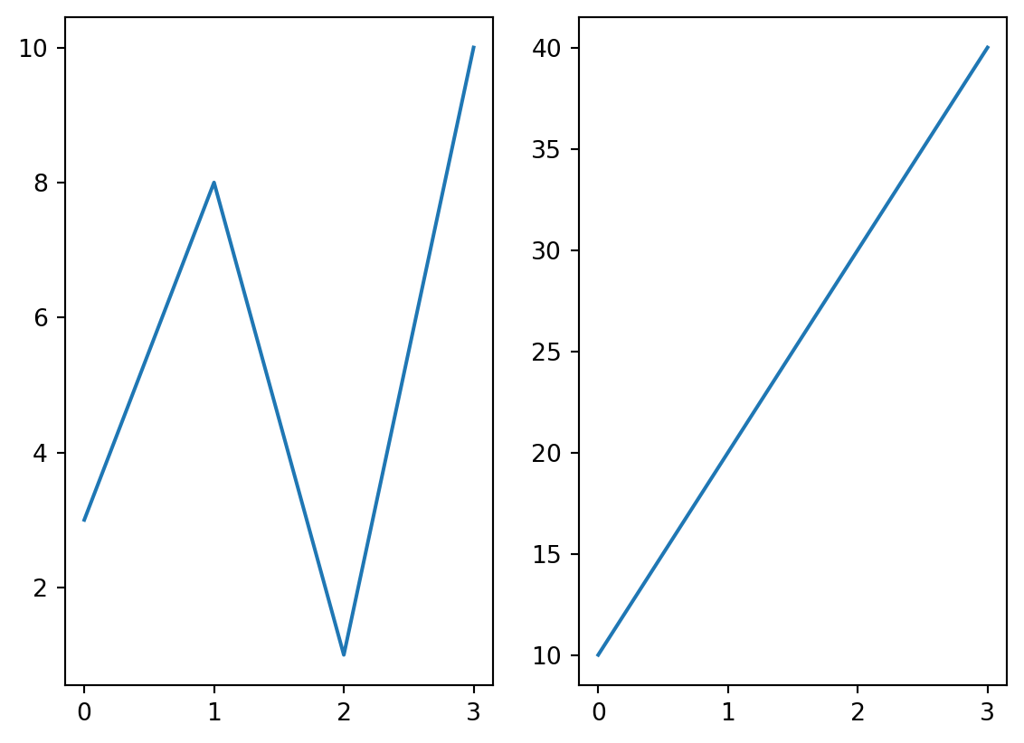
The subplot() function takes three arguments that describes the layout of the figure.
The layout is organized in rows and columns, which are represented by the first and second argument.
The third argument represents the index of the current plot.
import matplotlib.pyplot as plt
import numpy as np

#plot 1:
x = np.array([0, 1, 2, 3])
y = np.array([3, 8, 1, 10])

plt.subplot(2, 1, 1)
plt.plot(x,y)

#plot 2:
x = np.array([0, 1, 2, 3])
y = np.array([10, 20, 30, 40])

plt.subplot(2, 1, 2)
plt.plot(x,y)

plt.show()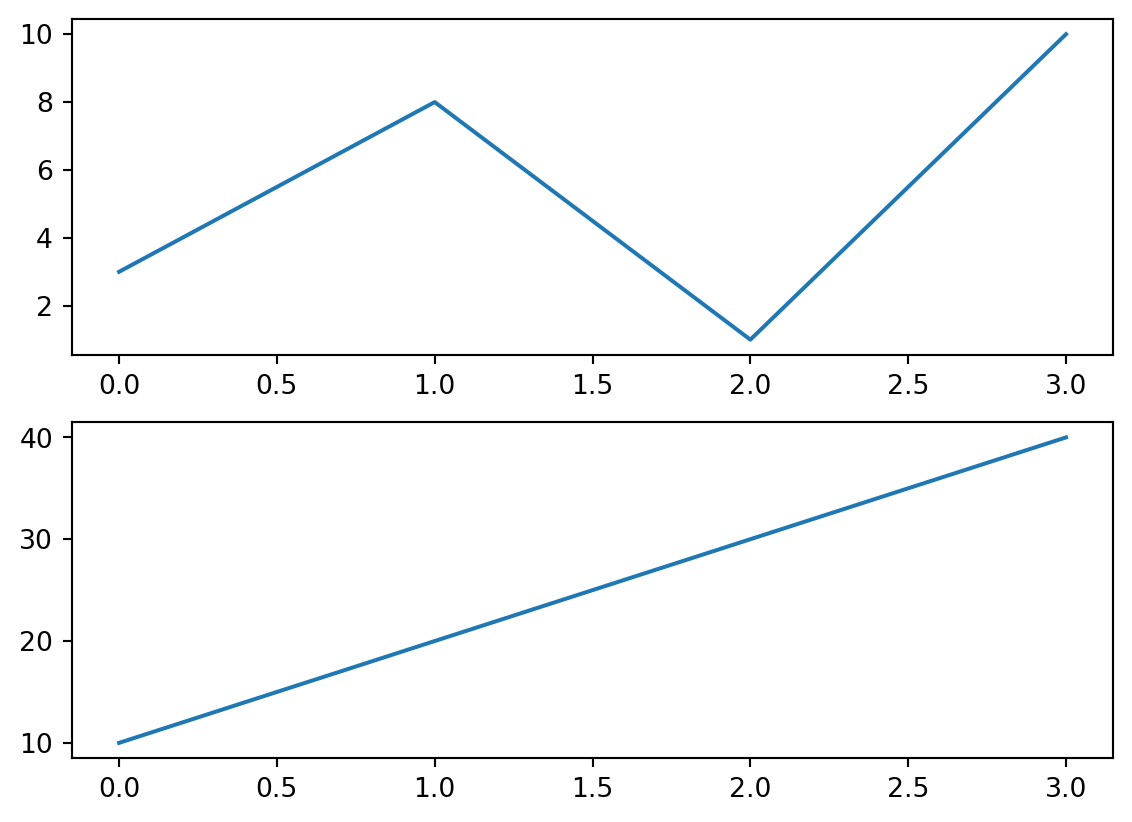
Other examples
Scatter
The scatter() function plots one dot for each observation.
It needs two arrays of the same length, one for the values of the x-axis, and one for values on the y-axis:
import matplotlib.pyplot as plt
import numpy as np

x = np.array([5,7,8,7,2,17,2,9,4,11,12,9,6])
y = np.array([99,86,87,88,111,86,103,87,94,78,77,85,86])

plt.scatter(x, y)
plt.show()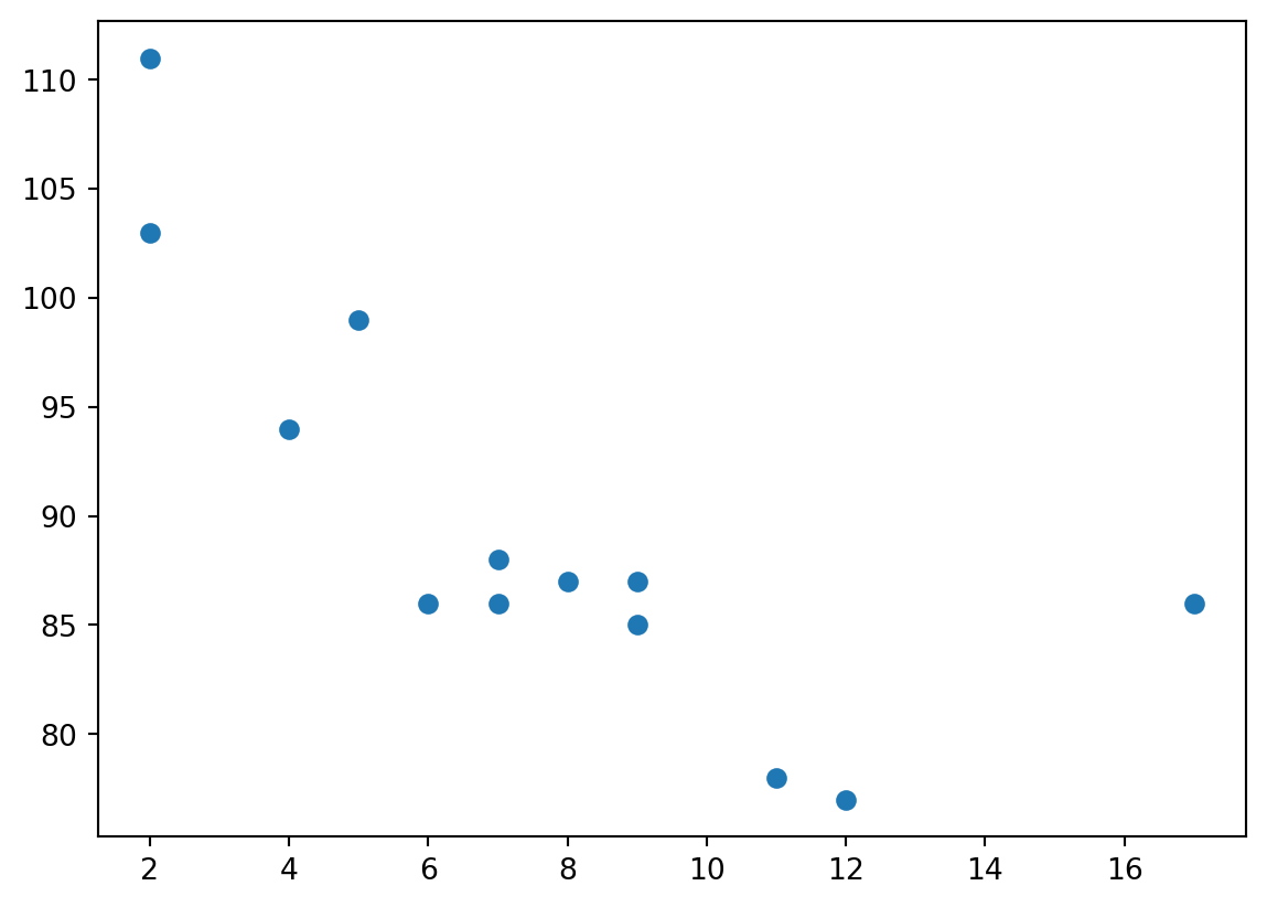
Bar
You can use the bar() function to draw bar graphs:
import matplotlib.pyplot as plt
import numpy as np

x = np.array(["A", "B", "C", "D"])
y = np.array([3, 8, 1, 10])

plt.bar(x,y)
plt.show()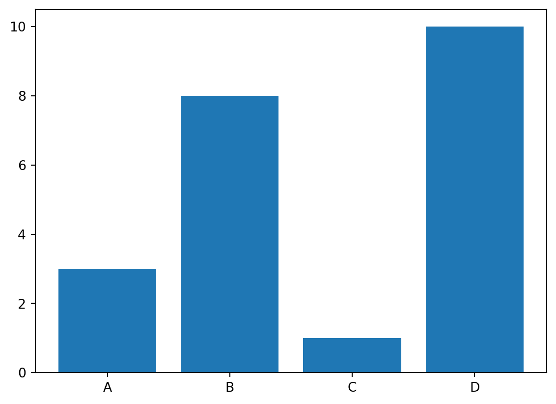
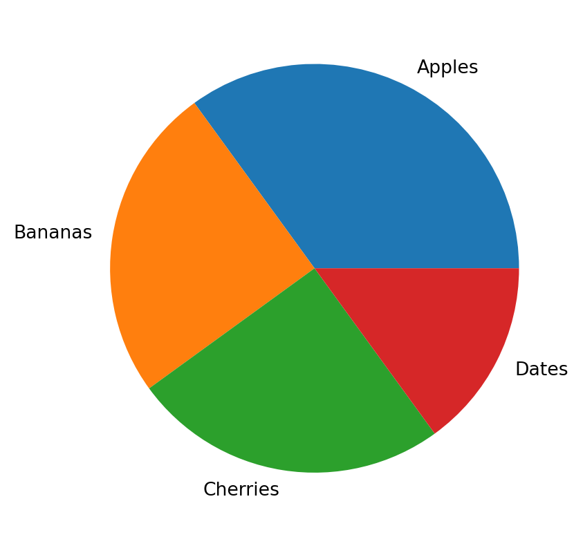
Pie chart
You can use the pie() function to draw pie charts:
import matplotlib.pyplot as plt
import numpy as np

y = np.array([35, 25, 25, 15])
mylabels = ["Apples", "Bananas", "Cherries", "Dates"]

plt.pie(y, labels = mylabels)
plt.show()